Data Visualization: Examples and Resources
Books about Data Visualization


Data Visualization Examples
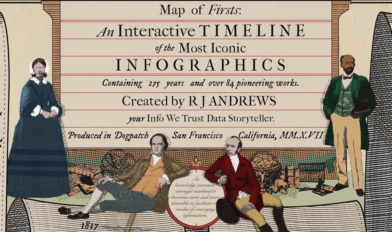
Info we Trust
Info we Trust is an interactive timeline of the world's most iconic infographics, which lets you explore 300 years of data visualization history. Read more about it here: "Interacting with the History of Data Viz" (RJ Andrews, Sept. 28, 2017). Image source: "Interacting with the History of Data Viz."

Gapminder Tools
Gapminder Tools, a site by the Swedish non-profit Gapminder Foundation, visualizes data on global economics, health, education, population, and more. Image source: Gapminder Tools free visualization, CC-BY license.

Simulated Dendrochronology of U.S. Immigration 1790-2016
This project by Pedro Cruz, John Wihbey, Avni Ghael, and Felipe Shibuya visualizes immigration to the United States over time as tree-rings, across the decades from 1830 to 2016. Image source: "Simulated Dendrochronology of U.S. Immigration 1790-2016."

Jonni Walker's Tableau Portfolio
View a portfolio of infographics created in Tableau by Jonni Walker; additional information available on his Data Blog. Image source: The Kakapo, created by Chris DeMartini, Rody Zakovich and Jonni Walker (2017).

Visualization Universe
Visualization Universe, a collaboration between Google News Lab and Adioma, collects and displays data on graphs, books, and tools for data visualization. Image source: Visualization Universe.
UB Libraries Resources
UB Libraries Workshops
Research Data Management Guide
Data Visualization Blogs and Galleries
Blogs
Storytelling with Data - a blog by Cole Nussbaumer Knaflic
Visualising Data - website and blog by Andy Kirk
Flowing Data - a blog by Nathan Yau
Information is Beautiful - a blog by David McCandless
Day Doh Viz - data visualizations in play-doh by Amy Cesal
Chartable - a blog by Datawrapper
Graphic Detail - The Economist's data journalism blog
Modern Data - Plotly's data visualization blog
Xenographics - weird but (sometimes) useful charts
Galleries
General:
Tableau Public - Viz of the Day
Information Is Beautiful Awards
JavaScript, R, and Python:
Maps:
Data Visualization was created by UB Libraries' 2018-2020 CLIR Postdoctoral Fellow, Rachel Starry. It is currently maintained by Carolyn Klotzbach-Russell. Guide content is licensed CC BY 4.0.
